Observability
The Observability page is for operators and on-call developers who need to answer "is the control plane healthy right now?" and "where did that error come from?" The dashboard ships with a built-in answer for the right now part; for deeper history, distributed traces, and exception search you turn on Azure Application Insights from Settings.
Quick jumps
- When to use which surface · Sidecar runtime band · HTTP request inspector
- Enable Application Insights · What lands in App Insights · Application Map · Investigate Performance · Investigate Failures · End-to-end transaction details
- AKS Cluster Monitoring (optional) · ElasticBLAST execution dashboard · Troubleshooting
When To Use Which Surface
| Question | Best surface |
|---|---|
| Is every sidecar healthy right now? | Sidecar runtime band on the Dashboard |
| Which sidecar is hot on CPU or memory? | Sidecar runtime band (per-sidecar cpu % / mem cells) |
| Did the browser see HTTP errors in the last few minutes? | HTTP request inspector (top-right Inspect HTTP requests button) |
| Which component or dependency is unhealthy across the whole topology? | Application Insights → Application map |
Why did /api/blast/jobs return 500 ten minutes ago? |
Application Insights (request + dependency + exception view) |
| Show me a Celery worker exception trace | Application Insights (exception telemetry from the worker sidecar) |
Correlate a request_id across api / worker / beat |
Application Insights (filter on customDimensions.request_id) |
| Long-term latency or error-rate trend | Application Insights (workbooks, KQL queries) |
| Pod / node / kubelet metrics from inside the AKS cluster | AKS → Monitor (free tabs) — enable Managed Grafana only for a learning tour or an active in-cluster incident |
The built-in surfaces are always on and require no setup — they are the first thing to check when something feels slow. Application Insights is opt-in and is the right tool when the in-page window is too short or you need cross-sidecar correlation.
Built-In Dashboard Surfaces
These two cards are part of the Dashboard. They use the dashboard's own /api/monitor/sidecars and /api/monitor/sidecar-requests endpoints and do not depend on App Insights at all — they keep working even when telemetry export is turned off.
Sidecar Runtime Band
The Sidecar runtime band sits at the bottom of the Dashboard and visualises the six-sidecar layout (frontend, api, worker, beat, redis, terminal) inside the running ca-elb-dashboard revision. Each tile shows the sidecar's health dot, current CPU %, and memory usage; the connecting lines describe the in-revision data flow (browser → api, api → redis → worker, beat → redis, api ↔ terminal).
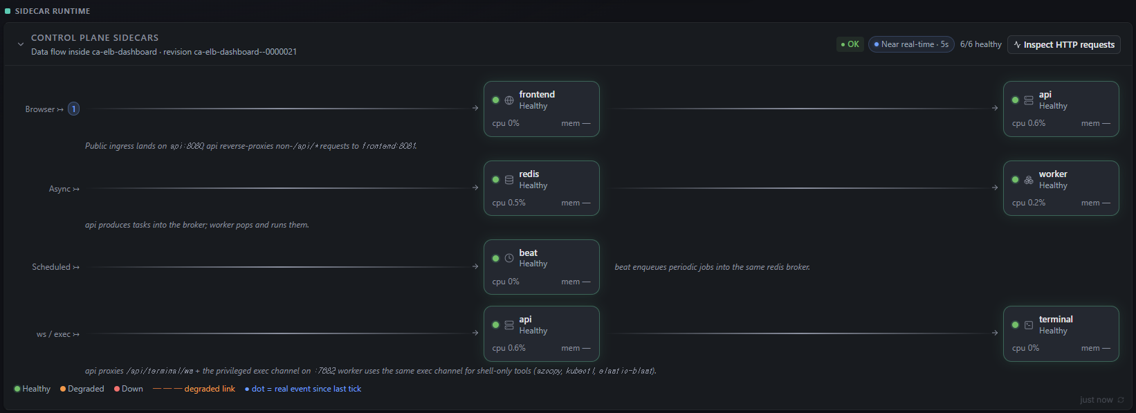
Key things to read off the card:
| Cell | Meaning | What "bad" looks like |
|---|---|---|
| Health dot (green / amber / red) | Per-sidecar liveness rolled up from the in-revision Redis health channel | A red down dot or a degraded link styled as a dashed line between two tiles |
cpu % |
Recent CPU sampled by the cgroup reporter every few seconds | A sidecar pegged near 100 % for sustained windows |
mem |
Resident memory against the sidecar's request | Approaching the configured limit (visible in Settings → Sizing) |
Near real-time · 5s chip |
Refresh cadence | "Stale" or no refresh means the dashboard cannot reach the monitor endpoint |
Inspect HTTP requests button |
Opens the HTTP request inspector overlay | — |
The band intentionally hides on narrow screens because it is admin-only telemetry. Open the dashboard on a larger viewport (or rotate a tablet) to see it.
HTTP Request Inspector
Clicking Inspect HTTP requests opens a modal that streams the most recent requests served by the api sidecar. The top chart plots per-request latency on a log scale with the SLA line (default 2,000 ms) overlaid; the table below lists each request with method, path, caller, status, duration, and response size.
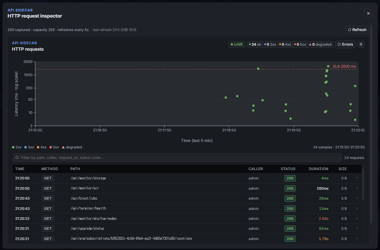
Use it for:
- Quick error triage — the Errors chip in the top-right filters the table to non-2xx rows so you can see what failed in the last few minutes without leaving the dashboard.
- SLA bursts — points above the dashed
SLA 2000 msline are the first signal that a Storage or AKS call is slowing down. - Per-path investigation — the filter box accepts substrings of path, caller,
request_id, or status code. Combine with the chip totals (24 ok · 0 3xx · 0 4xx · 0 5xx · 0 degraded) to confirm an absence of errors before closing a ticket.
The inspector keeps the most recent 256 requests in memory and refreshes every 5 seconds. For anything older than that buffer — or for requests served by other sidecars (worker, beat) — switch to Application Insights.
Enable Application Insights
The built-in surfaces stop helping when you need history. Settings → Telemetry wires the Container App and the SPA to an Application Insights component so traces, requests, dependencies, and exceptions persist for the configured retention window.
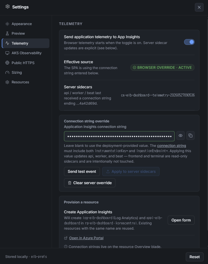
The panel is split into three rows:
- Send application telemetry to App Insights — a master toggle. When on, the SPA initialises the Application Insights JavaScript SDK and starts sending page views, dependencies, and unhandled errors from the browser. The toggle is per-browser (stored in
localStorage["elb-prefs"]) so individual operators can turn telemetry on for themselves without affecting other users. - Effective source + Server sidecars — read-only status lines. Effective source tells you whether the SPA is using the deployment-provided connection string or a manual override entered in this panel. Server sidecars shows the last connection string suffix that was applied to
api/worker/beatand the revision name that landed it (e.g.ca-elb-dashboard--telemetry-…). - Connection string override — the manual entry field. Pasting a full Application Insights connection string (it must contain both
InstrumentationKey=andIngestionEndpoint=) takes precedence over the deployment value. Thefrontendandterminalsidecars are intentionally read-only and are never patched from this panel.
Three buttons drive server-side actions on the override row:
- Send test event — fires a single
telemetry-testevent from the browser using the SPA-side connection string. Look it up in App Insights → Logs withcustomEvents | where name == "telemetry-test"to confirm ingestion. - Apply to server sidecars — enqueues a Celery task (
api.tasks.azure.apply_app_insights_to_deployment) that patches theAPPLICATIONINSIGHTS_CONNECTION_STRINGenvironment variable on theapi,worker, andbeatsidecars. Container Apps performs a revision swap; the new revision is named with a--telemetry-…suffix that matches the Server sidecars status line. - Clear server override — reverses the apply by removing the override env var. The sidecars fall back to whatever the deployment template provided originally (typically the App Insights component created by
azd up).
Provision A New Resource
If there is no Application Insights component yet — or you want a dedicated one separate from the azd-created default — use the Provision a resource card at the bottom of the panel. Open form asks for the subscription, resource group, name, region, and Log Analytics workspace, and Create Application Insights enqueues api.tasks.azure.provision_app_insights which creates both appi-elb-dashboard and its backing log-elb-dashboard workspace under rg-elb-dashboard / koreacentral by default. Existing resources with the same name are reused, so this is safe to re-run.
Once the task completes, the new connection string appears in the override field and you can immediately Apply to server sidecars. The Open in Azure Portal link opens the component's Overview blade, where the connection string also lives.
What Lands In Application Insights
Once both the SPA toggle and the server-side override are on, you will see telemetry from every sidecar that runs Python (api, worker, beat) plus browser telemetry from the SPA. The most useful tables to query in App Insights → Logs are:
| Table | Source | Useful for |
|---|---|---|
requests |
api sidecar (FastAPI requests) and SPA fetch() calls |
Latency P50/P95/P99, error rate, slowest paths |
dependencies |
Outbound calls from api / worker (Azure SDK, Storage, AKS, ACR) |
Which Azure API call slowed down a request |
exceptions |
Unhandled exceptions from any Python sidecar | Stack traces correlated to the failing request_id |
customEvents |
telemetry-test, feature lifecycle events, and servicebus_request queue lifecycle events |
Confirming ingestion and tracing feature or queue outcomes |
traces |
Structured log records (LOGGER.info / warning / error) |
Reading the full request lifecycle — auth, route, task enqueue, task result |
Every record carries customDimensions.request_id (set by the dashboard's request middleware), cloud_RoleName (the sidecar name), and operation_Id for distributed-trace correlation. The fastest way to debug a 500 you saw in the HTTP request inspector is:
union requests, exceptions, dependencies, traces
| where customDimensions.request_id == "<rid-from-response-body>"
| order by timestamp asc
That returns a single timeline that crosses sidecars (api → worker, api → Azure SDK, etc.) and includes the matching exception stack if any.
Feature Lifecycle Events
Beyond raw requests and traces, the worker and beat sidecars emit a feature event at the terminal transition of every long-running operation — warmup, cluster provisioning, BLAST database preparation, and BLAST job submission. Each event is a single record on the api.events logger that carries the customEvent name attribute, so it lands in both the traces table (as a structured log line) and the customEvents table (as a named event). When telemetry is disabled the same call is a local log line only — there is zero Azure ingestion cost, and no code path forces it on.
Query the catalogue from App Insights → Logs:
customEvents
| where name in ("warmup", "cluster_provision", "prepare_db", "blast")
| project timestamp, name, tostring(customDimensions.event_status),
          tostring(customDimensions.phase), tostring(customDimensions.job_id),
          tostring(customDimensions.error_code)
| order by timestamp desc
Only terminal transitions emit an event (event_status ∈ completed / failed / cancelled), so a per-tick progress update never floods the table. The phase dimension carries the fine-grained machine string the dashboard switches on, and error_code is populated on failures.
customEvents.name |
Emitted by | event_status values |
Key phase values (machine strings) |
|---|---|---|---|
warmup |
api.tasks.storage.warmup_database |
completed, failed |
completed, failed (preceded by non-terminal starting → downloading → sharding → planning_node_warmup) |
cluster_provision |
api.tasks.azure.provision |
completed, failed |
completed, failed (5-step pipeline: creating_cluster → ensuring_resource_group → arm_create_or_update → ensuring_rbac → completed) |
prepare_db |
api.tasks.storage.prepare_db_via_aks |
completed, failed |
completed (promoted) / partial (some shards failed); error_code + outcome dimensions explain partials |
blast |
api.tasks.blast.* (submit / cancel / poll) |
completed, failed, cancelled |
completed, submit_failed, cancelled, submit_retryable_failure, config_invalid, terminal_unavailable, status_unavailable |
servicebus_request |
Service Bus producer + drain consumer | enqueued, enqueue_failed, accepted, retry_ack_replayed, correlation_conflict, rejected, abandoned, deferred |
Request-queue lifecycle decisions; see below |
Service Bus Request Queue Events
When server-side Application Insights is configured, each internally produced
Service Bus request emits an enqueued event and each drain attempt emits one
decision event. Existing aggregate drain lines (received, completed,
abandoned, dead_lettered, and concurrency) remain in traces; the new
servicebus_request event makes individual requests searchable in
customEvents.
Only bounded scalar metadata is recorded: correlation/request/message/OpenAPI job ids, queue, program, database, taxonomy direction, delivery/sequence counters, settlement action, ACK-published flag, and error code. Query FASTA, BLAST options, raw message bodies, credentials, and completion payloads are not accepted by the telemetry helper and never enter these events.
Classic Application Insights schema:
customEvents
| where timestamp > ago(24h)
| where name == "servicebus_request"
| extend stage = tostring(customDimensions.stage),
         corr = tostring(customDimensions.correlation_id),
         request_id = tostring(customDimensions.request_id),
         job_id = tostring(customDimensions.openapi_job_id),
         action = tostring(customDimensions.action),
         error_code = tostring(customDimensions.error_code),
         ack_published = tobool(customDimensions.ack_published)
| project timestamp, stage, corr, request_id, job_id, action,
          error_code, ack_published, cloud_RoleName
| order by timestamp desc
Workspace-based Application Insights uses AppEvents, Name, Properties,
and TimeGenerated instead:
AppEvents
| where TimeGenerated > ago(24h)
| where Name == "servicebus_request"
| extend stage = tostring(Properties.stage),
         corr = tostring(Properties.correlation_id),
         request_id = tostring(Properties.request_id),
         job_id = tostring(Properties.openapi_job_id),
         action = tostring(Properties.action),
         error_code = tostring(Properties.error_code),
         ack_published = tobool(Properties.ack_published)
| project TimeGenerated, stage, corr, request_id, job_id, action,
          error_code, ack_published, AppRoleName
| order by TimeGenerated desc
The resident request consumer runs in the dedicated worker-servicebus Celery
parent. That parent initializes Azure Monitor after its child pool has forked,
so these dimensions reach AppEvents without exporter threads being inherited
by children. A payload-free scalar copy is also written to Container App
console logs (servicebus_request stage=... corr=... action=...) as a fallback.
Use it when investigating the short startup interval before telemetry is ready:
ContainerAppConsoleLogs_CL
| where TimeGenerated > ago(24h)
| where ContainerName_s == "worker"
| where Log_s contains "servicebus_request stage="
| project TimeGenerated, Log_s, RevisionName_s
| order by TimeGenerated desc
Queue depth and DLQ backlog remain namespace metrics (ActiveMessages and
DeadletteredMessages) rather than one event per poll, avoiding telemetry noise
while preserving historical alerting through Azure Monitor metrics.
For deployments that accept direct external producers, the reconcile worker
also emits one payload-free servicebus_health event every five minutes. It
captures the request/completion queue counts, drain admission, durable response
outbox backlog, latest in-process flush outcome, and completion configuration.
This distinguishes "not received yet" from "admission blocked", "retrying",
"dead-lettered", and "response waiting to publish" without changing the
customer message contract.
The outbox_last_* fields describe the current isolated reconcile worker
process and reset after a worker restart or child recycle. Durable truth is the
outbox pending count and oldest_age_seconds; avoid alerting on an empty
last-attempt timestamp during the first health interval after deployment.
AppEvents
| where TimeGenerated > ago(24h)
| where Name == "servicebus_health"
| extend status = tostring(Properties.event_status),
         warnings = tostring(Properties.warning_codes),
         active = toint(Properties.queue_active),
         scheduled = toint(Properties.queue_scheduled),
         request_dlq = toint(Properties.queue_dead_letter),
         outbox_pending = toint(Properties.outbox_pending),
         outbox_oldest_s = toint(Properties.outbox_oldest_age_seconds),
         completion_configured = tobool(Properties.completion_configured),
         completion_accessible = tobool(Properties.completion_accessible),
         admission_allowed = tobool(Properties.admission_allowed),
         admission_reason = tostring(Properties.admission_reason)
| project TimeGenerated, status, warnings, active, scheduled, request_dlq,
          outbox_pending, outbox_oldest_s, completion_configured,
          completion_accessible, admission_allowed, admission_reason, AppRoleName
| order by TimeGenerated desc
To see only failures across every feature in one query:
customEvents
| where tostring(customDimensions.event_status) == "failed"
| project timestamp, name, tostring(customDimensions.phase),
          tostring(customDimensions.error_code), tostring(customDimensions.job_id)
| order by timestamp desc
Non-terminal phases live in jobstate, not customEvents
The intermediate phases (downloading, arm_create_or_update, submitting, …) are written to the Azure Table jobstate row and the per-job history that the dashboard renders live. They also reach App Insights as traces whenever the surrounding code logs them, but only the terminal transition is promoted to a named customEvent. Use the jobstate-backed dashboard job timeline for live progress and customEvents for "did this operation ultimately succeed or fail, and why?".
Application Map
Application Insights → Investigate → Application map is the topology view. It draws every cloud role the dashboard emits telemetry from (the SPA, plus every Python sidecar) and every outbound dependency they call, with the average latency and call count on each edge. It is the right place to start when an alert fires and you do not yet know which component is unhealthy.
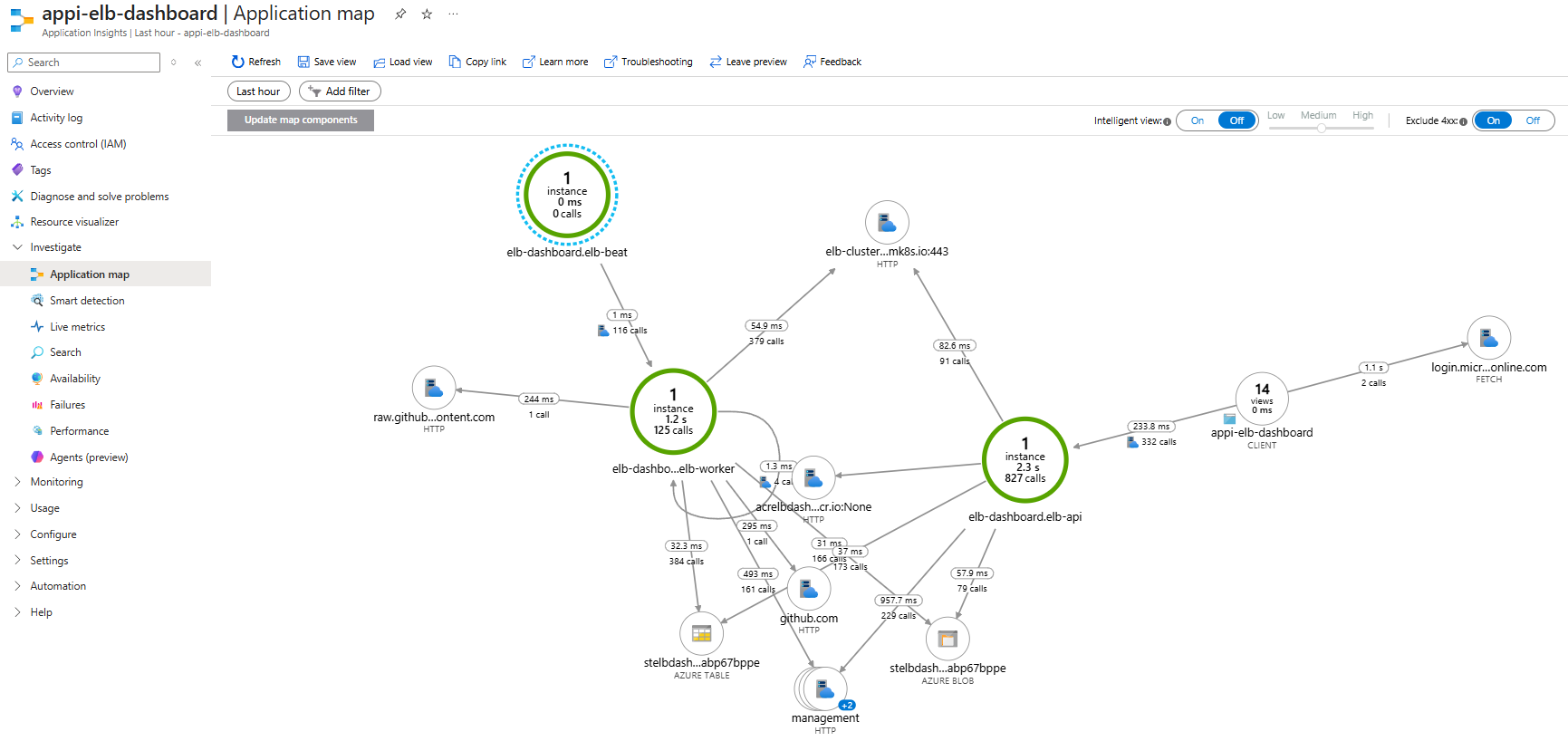
What the nodes and edges mean:
appi-elb-dashboard(CLIENT) — the SPA itself. Edges leaving this node are browser-sidefetch()calls. The arrow tologin.micr…online.comis MSAL sign-in; the arrow intoelb-dashboard.elb-apiis every API call from the SPA.elb-dashboard.elb-api/elb-worker/elb-beat— one node per Python sidecar (cloud_RoleNamevalue). The count inside the circle is the number of distinct instances seen in the window — for the bundled Container App it should always be1because the revision is pinned atminReplicas: 1, maxReplicas: 1. A count greater than 1 means there was a revision rollover during the window.- Outbound HTTP nodes —
management.azure.com(ARM),acrelbdash…cr.io(ACR),elb-cluster…mk8s.io:443(AKS API server),github.com/raw.github…content.com(manifest and rendering downloads). - Storage nodes —
stelbdash…abp67bppeappears twice, once as AZURE TABLE (job/audit state) and once as AZURE BLOB (queries / results / database files). They are the same Storage account; App Insights groups by data-plane API. - Edge labels — the headline number is the average call duration for the window; the
N callsline is the total. Wide / thick edges represent the busiest paths.
Reading the map:
- Use the Time range in the top-left (
Last hourby default) to scope the picture. - Intelligent view automatically highlights nodes with anomalous latency or failure rates against the baseline. Leave it On when triaging an unknown problem; turn it Off when you want to compare absolute numbers.
- The Low / Medium / High slider next to it controls the sensitivity of the highlighting.
- Exclude 4xx is On by default. Keep it on for capacity / latency work (a 404 is not the api sidecar's fault), turn it off when investigating a misuse of the API.
- Click any node to open a side panel with that role's
requests,dependencies, andexceptionscounts, plus shortcuts to Investigate failures, Investigate performance, and Go to details. Click an edge to filter the same panel to just the calls that traverse that edge.
The map is also a good sanity check after a deploy: if a dependency you expected (for example a new ACR or a new AKS service IP) does not appear, the new code never made a request to it during the window — usually a sign the feature flag is off or the workload is not exercising the new path.
Investigate Performance
For a guided latency view that does not require KQL, open Application Insights → Investigate → Performance. The blade is the right starting point when the HTTP request inspector chip says "p95 climbing" or a researcher reports that a specific endpoint feels slow.
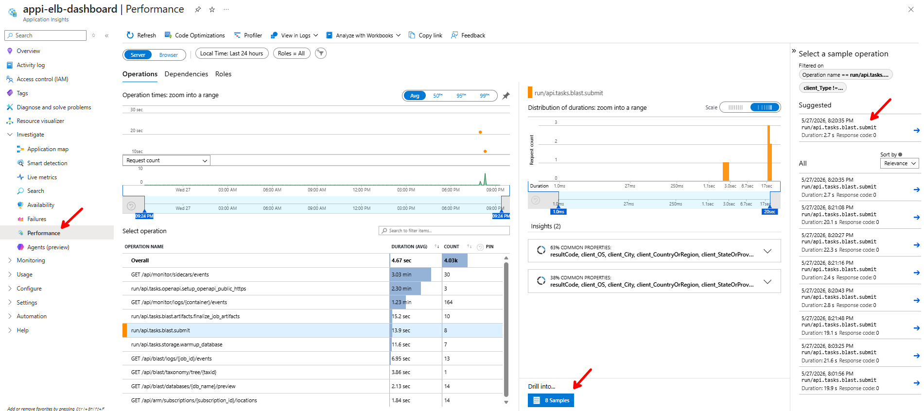
How to read the blade:
- Roles toggle (top-left,
Server/Browser) — Server shows Python sidecars (elb-dashboard.elb-api,elb-dashboard.elb-worker); Browser shows the SPA. Keep it on Server for backend latency analysis. - Time range — defaults to the last 24 hours. Narrow it to the window the researcher mentioned so the distribution histogram is meaningful.
- Operation times chart — average duration plotted over the window. Bumps that line up with a deploy are worth investigating.
- Select operation table — every distinct operation seen in the window, sorted by average duration and total count. Long-running Celery tasks appear with their full Python path (e.g.
run/api.tasks.blast.submit,run/api.tasks.openapi.setup_openapi_public_https), and FastAPI routes appear with the templated path (e.g.GET /api/monitor/sidecars/events). - Distribution of durations (middle) — histogram of every invocation of the operation selected on the left. The
Avg / 50ᵗʰ / 95ᵗʰ / 99ᵗʰtoggle at the top of the operations chart switches the headline number; the histogram itself is unfiltered. Brush a range on the histogram to zoom into one duration bucket. - Suggested / All samples sidebar (right) — concrete invocations whose duration falls inside the brushed range. Each row shows the timestamp, duration, and response code.
- Drill into → N Samples — opens the end-to-end transaction view for the sampled invocation. This is the path that takes you from "this operation is slow on average" to "this specific request was slow, here's the dependency that took 12 seconds."
Workflow tip: when triaging a slow operation, switch the operations chart to 95ᵗʰ percentile, find the tallest bar in the operations table, brush the right-hand spike in the duration histogram, and click N Samples in the bottom-right. That sequence narrows hours of telemetry to the handful of slow runs that actually need a trace read.
Investigate Failures
Application Insights → Investigate → Failures is the matching view for errors. Open it when the HTTP request inspector shows a non-zero 5xx chip or the dashboard surfaces a "task failed" toast.
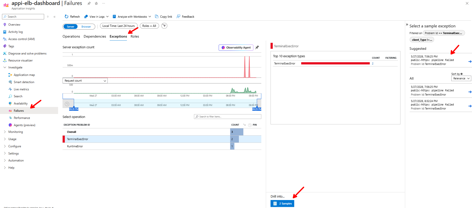
The layout mirrors Performance but with three tabs at the top — Operations, Dependencies, and Exceptions — each scoped to the same time range and Server / Browser toggle:
| Tab | Counts what | Best for |
|---|---|---|
| Operations | Requests / operations that ended in a 4xx or 5xx |
Finding the endpoint or Celery task that is failing most often |
| Dependencies | Outbound calls (Azure SDK, Storage, AKS, GitHub raw) that returned a failure | Confirming a failure is upstream (ARM throttling, ACR push 429, GitHub raw 404) rather than in our code |
| Exceptions | Unhandled Python exceptions grouped by Exception Problem Id | Mapping a recurring symptom to a specific exception class + call site |
On the Exceptions tab the Server exception count chart spikes at every failure, the Top 10 exception types chart on the right ranks the noisiest exception classes, and the Select operation table groups by Problem Id (e.g. TerminalExecError, RuntimeError). The Suggested / All samples sidebar on the far right lists concrete occurrences with timestamp and short message.
Clicking Drill into → N Samples (or any sample row) opens the end-to-end transaction details for that exception:
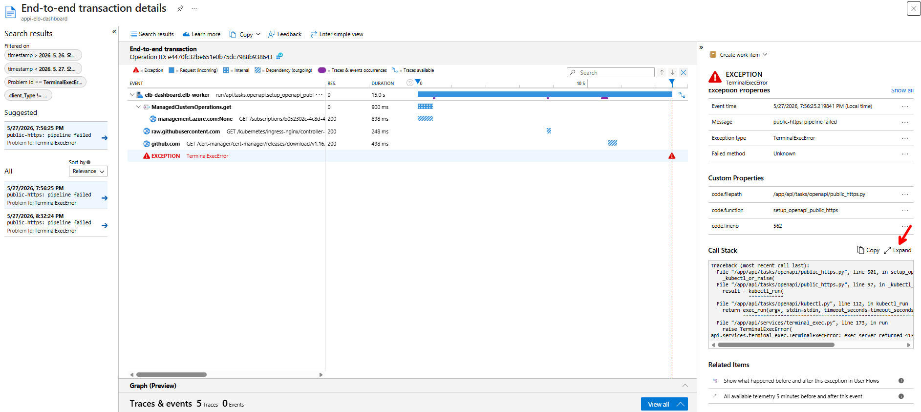
Key panels in this view:
- End-to-end timeline (left) — every span the operation produced, in order: the originating request (
run/api.tasks.openapi.setup_openapi_public_https), each outbound dependency (management.azure.com,raw.githubusercontent.com,github.com), and the failure marker (red triangle) at the moment the exception was raised. Hovering a bar shows the exact duration and HTTP status. - Exception properties (right) —
Event time,Message(e.g.public-https: pipeline failed),Exception type(e.g.TerminalExecError), andFailed method. Use theMessagevalue as the first thing to grep for in a triage thread. - Custom properties — the dashboard tags every exception with
code.filepath,code.function, andcode.lineno. That triple takes you straight to the line in the repository without having to read the traceback (here:api/tasks/openapi/public_https.py::setup_openapi_public_https:562). - Call Stack — the full Python traceback. Click Expand to see the whole frame chain. Operators should copy this into the support ticket as-is; it is the highest-signal artifact for a developer.
- Related Items — "Show what happened before and after" and "All available telemetry 5 minutes before and after" pivot to the same operation's neighbours, which is how you confirm whether the failure was isolated or part of a wider incident (a Storage outage, an AKS API throttle, etc.).
Together, Application map answers "what depends on what right now", Performance explains "what is slow", Failures → Exceptions → end-to-end explains "what crashed and where in the code", and the built-in HTTP request inspector tells you whether the problem is happening right now.
End-To-End Transaction Details
Both Performance and Failures drill into the same End-to-end transaction details view, and it is also reachable from Search results when you start from a raw query. The view fans out a single operation into every span it produced — the originating request at the top, then nested dependencies in call order.
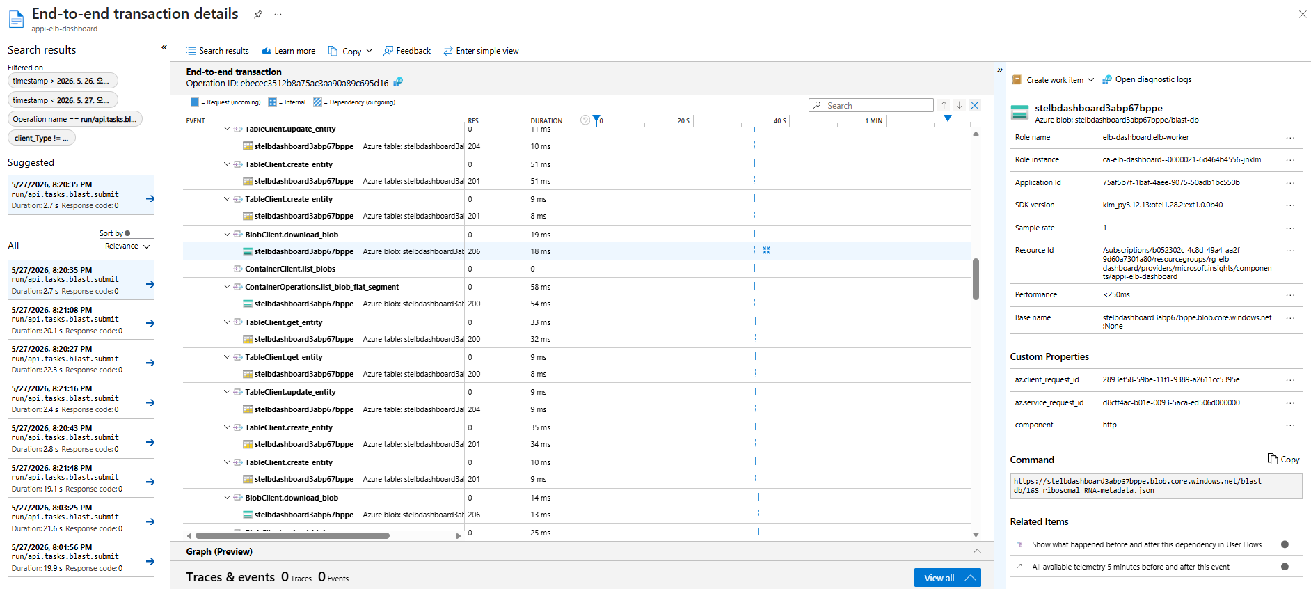
What to read off the screen:
- Search results panel (far left) — every other operation that matched the same filter (
Operation name == run/api.tasks.blast.submithere). Use it to compare a slow run against a fast neighbour. - Timeline (centre) — each span as
<client>.<method>with itsRes(ponse)code andDuration. The header colour chips at the top (Request,Internal,Dependency) match the row glyphs so you can scan for outbound storage calls vs in-process work. - Properties panel (top-right) —
Role name(elb-dashboard.elb-workerfor Celery tasks),Role instance(the Container App replica name, e.g.ca-elb-dashboard--0000021-…),SDK version, andResource Idof the App Insights component itself. Sample rate stays at1for the dashboard's default config (no sampling). - Custom Properties — per-span attributes the Azure SDK emits:
az.client_request_idmatches thex-ms-client-request-idheader sent to Azure,az.service_request_idis the value Azure echoed back, andcomponent=httpflags the span as an outbound HTTP dependency. Quoteaz.service_request_idwhen opening an Azure support ticket — it lets the service team find the exact request on their side. - Command panel (lower-right) — the actual URL the SDK called, including the container path. For Storage spans this is the most useful field because it shows which blob (here,
blast-db/16S_ribosomal_RNA-metadata.json) the operation touched, which a stack trace alone never reveals. - Related Items (bottom-right) — "Show what happened before and after" pivots to the same role-instance's neighbour requests in a 5-minute window, which is how you confirm whether a slow span was part of a wider stall or an isolated blip.
AKS Cluster Monitoring (Optional)
Application Insights covers the control plane sidecars (the dashboard's own api / worker / beat). It does not show you what is happening inside the AKS workload cluster — BLAST pod node placement, kubelet CPU pressure, container restart loops, kube-system events. Azure provides a separate monitoring surface for that on the AKS resource itself: AKS → Monitor, which can be one click away from a real-time Managed Grafana dashboard when the cluster is wired up with Azure Monitor managed service for Prometheus and Container insights.
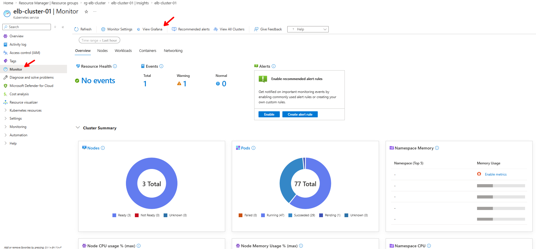
The built-in Monitor blade is free and always available. Its five tabs (Overview / Nodes / Workloads / Containers / Networking) read directly from the AKS API server, so they show the same node count, pod phases (Running / Succeeded / Pending / Failed), and namespace breakdowns the dashboard's Cluster Plane reads. Use this blade when you want a quick "is the cluster generally healthy" answer without leaving the portal.
Clicking View Grafana at the top of the blade jumps to the Managed Grafana workspace pre-loaded with the official Microsoft Kubernetes dashboards. From there you can drill into per-pod CPU/memory, container log streams, kubelet metrics, and per-node disk/network — in real time, at second-level granularity, which neither the dashboard nor App Insights provides for cluster-internal workloads.
Not enabled by default — and we do not recommend turning it on for routine work
Enabling the full Managed Grafana + Prometheus + Container insights stack adds a Managed Grafana workspace, an Azure Monitor workspace for Prometheus, and a Log Analytics workspace ingestion stream, each of which is billed independently. For the bundled control plane the BLAST cluster runs in short bursts, so most of that telemetry sits idle and the meter keeps ticking. Day-to-day operations are well served by Cluster Plane on the dashboard plus App Insights for the api/worker sidecars — leave the AKS Monitor → Grafana pipeline off unless you are actively debugging an in-cluster performance issue that the dashboard's K8s metrics cannot answer.
Worth enabling once for learning
That said, we strongly recommend enabling it once on a non-production cluster (or temporarily on the test cluster) just to explore what is available. Click Monitor Settings at the top of the blade, accept the recommended Container insights + Prometheus + Grafana defaults, wait a few minutes for data to flow, and then walk through the Microsoft-curated dashboards in Grafana (Kubernetes / Compute Resources / Node, Kubernetes / Compute Resources / Pod, Kubernetes / Networking / Cluster). It is the fastest way to understand which metrics the AKS control plane already exposes for free — and when an incident later forces you to enable it for real, you will already know which dashboards to open.
After the learning tour, delete the Grafana workspace and turn off Container insights to stop ongoing ingestion charges. Re-enabling it later is a one-click operation on the same Monitor blade.
Container Insights does not survive a cluster delete + recreate
The omsagent (Container Insights) addon lives on the AKS cluster resource, so deleting and recreating the cluster drops it — the new cluster comes up with cluster observability off even if the previous one had it enabled. The dashboard's own Application Insights telemetry (api / worker / beat) is unaffected because it lives on the Container App, not the cluster.
To restore it after a recreate, re-enable Container Insights from Settings → AKS Observability (one click; it re-applies the omsagent addon pointing at the platform Log Analytics workspace).
Operators who want this to happen automatically for dashboard-provisioned clusters can set AKS_PROVISION_ENABLE_CONTAINER_INSIGHTS=true on the api / worker sidecars. The provision task then re-enables Container Insights on every cluster it creates, using the LOG_ANALYTICS_WORKSPACE_RESOURCE_ID injected by the deployment. It is off by default: the addon ships node/pod telemetry to the same log-elb-dashboard workspace the control plane uses, which is capped at 1 GiB/day, so a busy BLAST cluster could exhaust the quota and starve the dashboard's own traces. Opt in only after sizing the workspace (or pointing the addon at a dedicated one). Clusters created by elastic-blast submit directly are outside this path and still need the manual re-enable.
ElasticBLAST Execution Dashboard (Grafana)
If you do choose to enable Managed Grafana — either during the learning tour above or for a real in-cluster incident — the repo ships a curated dashboard JSON tailored to the ElasticBLAST workload at grafana/dashboards/elb-blast-execution.json. It is a single Prometheus-backed view of a running BLAST job and is designed for the Azure Monitor managed Prometheus default scrape set (cAdvisor + node-exporter + kubelet) — no kube-state-metrics required.
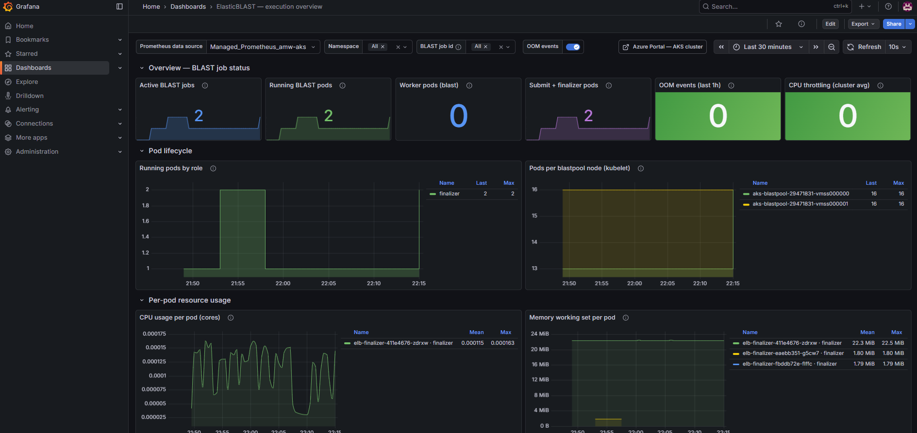
Three rows at a glance:
- Overview — BLAST job status — counters for Active BLAST jobs, Running BLAST pods, Worker / Submit / Finalizer pods, OOM events in the last hour, and cluster-average CPU throttling.
- Pod lifecycle —
Running pods by role(timeline of how manyblast/submit/finalizerpods exist) andPods per blastpool node(kubelet bin-packing per VMSS instance). - Per-pod resource usage —
CPU usage per pod (cores)andMemory working set per pod (MiB)so you can spot a single BLAST shard hitting its limit.
Scroll past those three rows for the Node pool — blastpool section, which is the same dashboard's real-time node-level view. Use it when the per-pod row above says "everything looks fine" but the cluster as a whole still feels slow — that usually means the VMSS instance underneath is saturated.
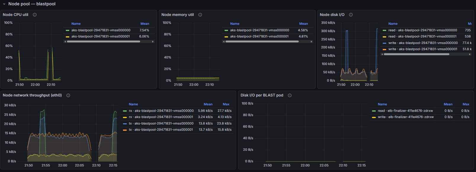
Five panels per VMSS instance (aks-blastpool-<id>-vmss000000, vmss000001, …):
- Node CPU util and Node memory util — node-wide percentages, with the per-instance legend on the right. Idle BLAST nodes typically sit in the single-digit % range (the screenshot shows 7.5 % / 6 % CPU and ~4.7 % memory); a sustained spike on one instance while others stay flat is the classic "one shard pinned to one node" pattern.
- Node disk I/O — read / write bytes per second per node. Bursts in the hundreds of kB/s are normal during BLAST DB warmup (vmtouch / shard copy); a flatline while pods are supposed to be running is a warning sign.
- Node network throughput (eth0) —
rx/txper node. Useful for spotting Storage download bottlenecks (highrxduring warmup) and result upload tails (hightxafter the BLAST run). - Disk I/O per BLAST pod — same series as above but scoped to the
elb-*pods, so you can attribute disk traffic to a specific finalizer / submitter / blast shard.
Together, the pod-level rows (execution overview) and the node-level row (Node pool — blastpool) give you a live, second-resolution picture of where capacity is going while a BLAST job runs.
Filters at the top of the dashboard (Prometheus data source, Namespace, BLAST job id, OOM events toggle) scope every panel — pod-level and node-level — to one job or one namespace at a time, and the Azure Portal — AKS cluster chip pivots back to the Monitor blade. Both views ship inside the single elb-blast-execution.json definition and import with one command:
az grafana dashboard create \
  --name <managed-grafana-name> \
  --resource-group <managed-grafana-rg> \
  --definition @grafana/dashboards/elb-blast-execution.json \
  --overwrite true
The same warnings from the section above apply — this dashboard is a consumer of the Managed Grafana + Prometheus pipeline, not a replacement for it, so the ingestion meter still ticks while it is connected.
Troubleshooting
| Symptom | Likely cause | What to do |
|---|---|---|
| Sidecar runtime band is missing | Narrow viewport — the band is hidden below a width threshold | Use a wider window or rotate the device. |
All sidecar tiles say unknown and the chip shows "Stale" |
The browser cannot reach /api/monitor/sidecars (auth, network, or the api sidecar is down) |
Check the browser network tab; verify the api sidecar is healthy in Azure Portal → Container Apps → Revisions. |
| HTTP request inspector is empty | The api sidecar recently restarted and the in-memory ring buffer is empty | Generate a request (refresh the dashboard) and watch it appear. For historical data, switch to App Insights. |
| Telemetry toggle is on but nothing appears in App Insights | Connection string is invalid, or the SPA is on an older bundle that has not picked up the override | Confirm the Effective source line says BROWSER OVERRIDE · ACTIVE, click Send test event, then search customEvents in App Insights. |
| Apply to server sidecars succeeded but server logs still missing | Connection string was applied to a revision that has not finished rolling out | Wait for the new ca-elb-dashboard--telemetry-… revision to become active in the Container Apps revisions blade. |
| Provision a resource fails with a permission error | The dashboard's user-assigned managed identity lacks Contributor on the target resource group |
Grant the missing role at the resource-group scope and retry. |
Safe Screenshot Practice
Before publishing screenshots from this page, scrub:
- Connection strings — the override field masks the value by default; use the eye icon only when typing and never screenshot the revealed state.
- Tenant-specific request URLs — subscription IDs, ACR names, and storage account names commonly appear in the HTTP request inspector table. Crop or redact the path column when sharing externally.
- Caller column — the
CALLERcell shows the signed-in user's principal. Replace with a generic name in shared screenshots.
The screenshots embedded above already follow these rules: the request paths show only generic monitor / blast routes, the caller is admin, and the connection string is masked.